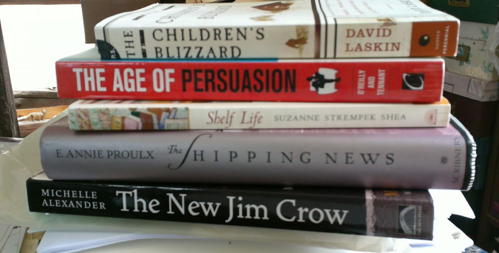
 Taking the 5 books we chose from the previous week, we were to comment on the aesthetic and practical considerations of our choices. After writing a short piece about each of the five, we selected one as our overall choice.
I chose The Children’s Blizzard by David Laskin. The book recounts the Great Blizzard of 1888, which swept across the Plains just as children were heading home from school. The morning of the storm had been unseasonably warm and many children did not wear coats, boots, hats, or mittens to school that day. This fine non-fiction book gives a wealth of background information and first hand accounts of this tragic event. The designer, along with the author, eases us into the story.
The design elements of this book are consistent on a micro and macro level. For the sample text, I used the opening chapter. The heading is in small caps. The chapter title, Deaprtures and Arrivals, is large and italicized; there is an urgency to the italics. To begin the chapter, there is an ornament where a drop cap would be placed. The angle of the ornament matches the path of the storm, pointing from northwest to southeast. The typeface is fairly heavy, serif, but also conveys a sense of space typical of the Great Plains. These ornaments, doubled, are also incorporated as section breaks.
The book, a trade paperback with an elaborate cutaway cover, is a very nice package. The Children’s Blizzard, though a rather grim slice of history, is a very attractive book with an evocative title. The design elements do not detract in any way and enhance the telling of the story. Read More…

